
THE ASV BLOG
— by JANICE NINAN
Idea to Identity
Mark Mondays | The Birth of the ASV Mark - The Logo Speaks
Every identity begins with a mark.
Before a brand, before a website, before even a name finds its full expression — there is a moment of pause where meaning seeks form. That was the beginning of Architecture Speaks Volumes.
When I first began to imagine the visual identity of ASV, I knew it had to do more than look appealing — it had to speak. The word “speaks” itself became my starting point, a conceptual key that unlocked everything that followed.
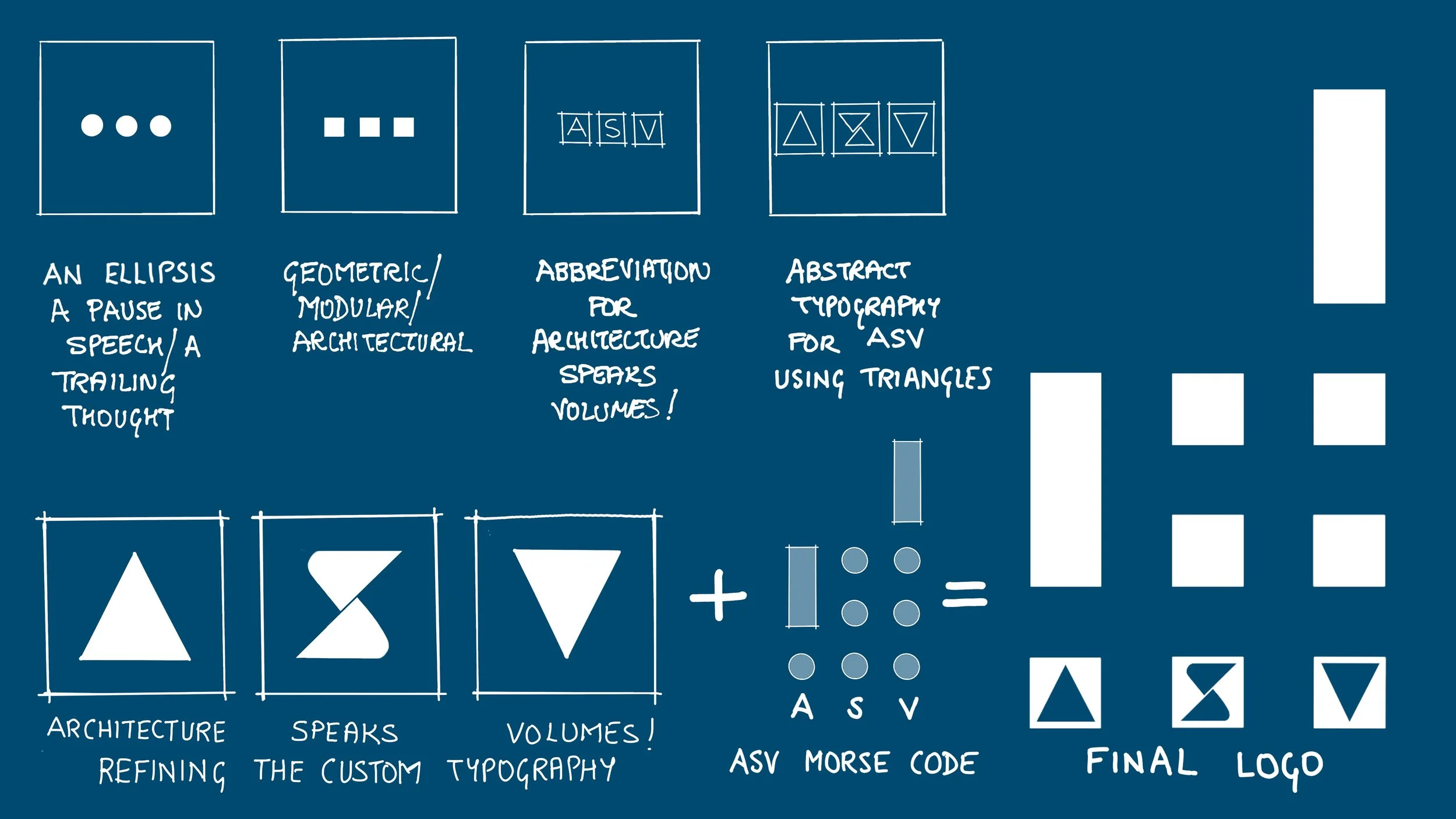
From Ellipsis to Architecture
Language often finds its pauses in the ellipsis — three dots suspended in continuity, holding the promise of something more to be said. That sense of continuation resonated deeply with me. Architecture, too, speaks in continuities: between material and memory, between structure and story.
So I began with three dots. Simple. Symbolic. A visual echo of speech waiting to unfold.
But as the design evolved, those dots took on form — transforming into three squares that could hold space, volume, and structure. Within each square, I began constructing the abbreviation A S V using triangles — the most elemental architectural form, the basis of strength and stability.
It was a small but significant shift — from punctuation to geometry, from language to architecture.
When Language Becomes Code
As I continued to refine the mark, I found myself drawn to the rhythm of Morse code — a system of dots and dashes that translates thought into signal. It was an elegant metaphor for communication itself: invisible, coded, yet universal.
Through Morse, I could abstract “A S V” into a vertical arrangement that merged my studio’s name with my own initials — embedding personal and professional identity into a singular architectural form.
The result resembled volume bars, rising and falling like waves of sound or the skyline of a city. It felt right — Architecture speaking volumes, visually and conceptually.
The Blueprint of an Idea
The final decision was color. I wanted the logo to evoke origins — not the polished finish of a completed project, but the process of design. The chosen hue, a deep blueprint blue, grounds the mark in the world of architecture: sketches, drafts, ideas, and construction lines.
Blueprints, after all, are not just technical documents. They are promises of something to come — much like an ellipsis, still unfolding.
More Than a Logo
In the end, the ASV mark is more than a logo. It’s a distilled conversation between language and form, speech and structure, identity and architecture.
It began as a whisper — three dots on a page.
It now stands as a statement — Architecture Speaks Volumes.
Closing Note
Every Mark Monday in the Atelier Diaries will return to this idea — how a mark, whether drawn, designed, or built, becomes the first word in a larger dialogue between vision and space.